Retreat Kr
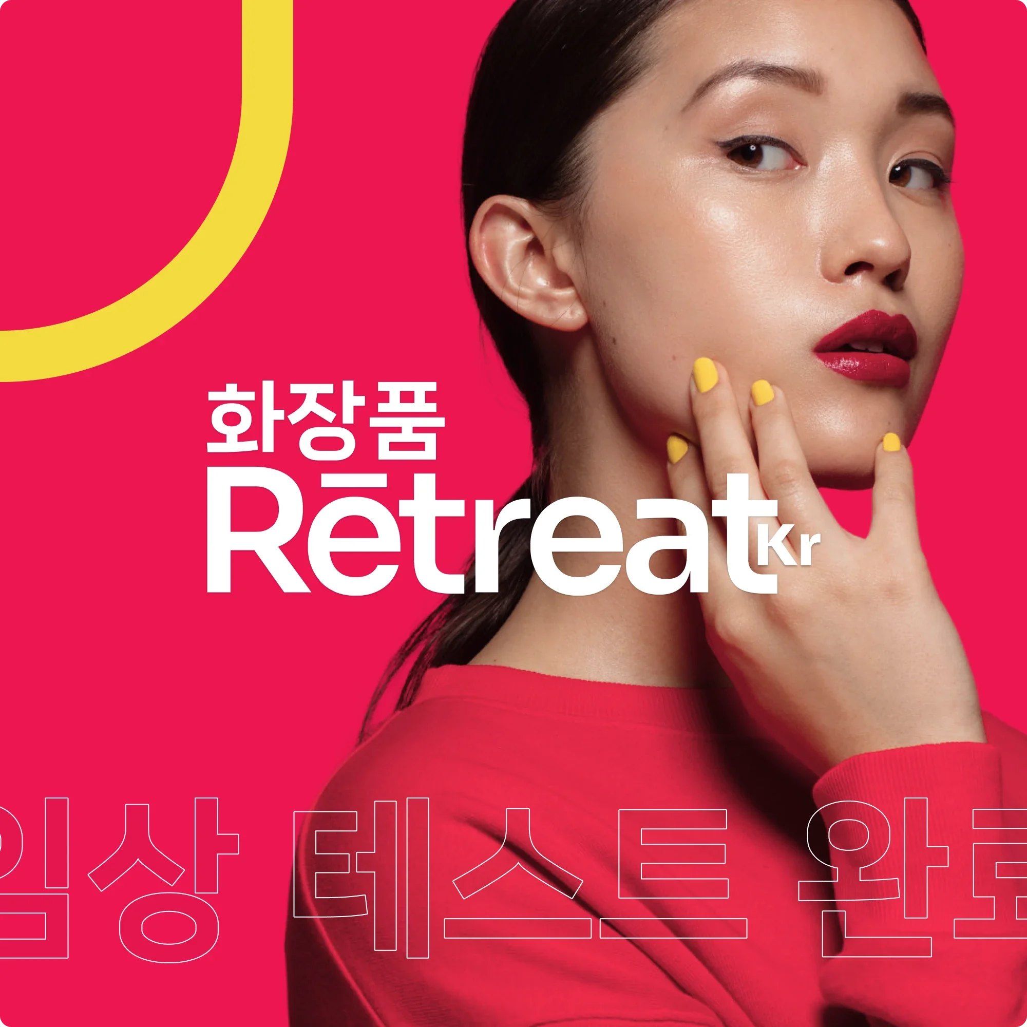
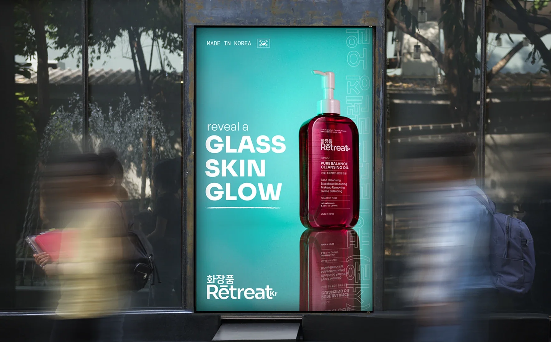
Retreat Kr needed to enter the US skincare market with the credibility of an established brand. I contributed to its identity, packaging and website from the ground up, translating Korean heritage into a clear, premium system.
Duration
16 WEEKS
Client
Retreat Kr
[
Earning shelf trust
]
Retreat Kr had strong foundations in its formulations, manufacturing and Korean origin. The problem was making that substance visible in a US category where customers assess credibility in seconds and where familiar beauty conventions make many new brands look interchangeable. The identity needed to express cultural origin with specificity while creating enough clarity and authority to support a full product range.
01



[
Heritage as identity
]
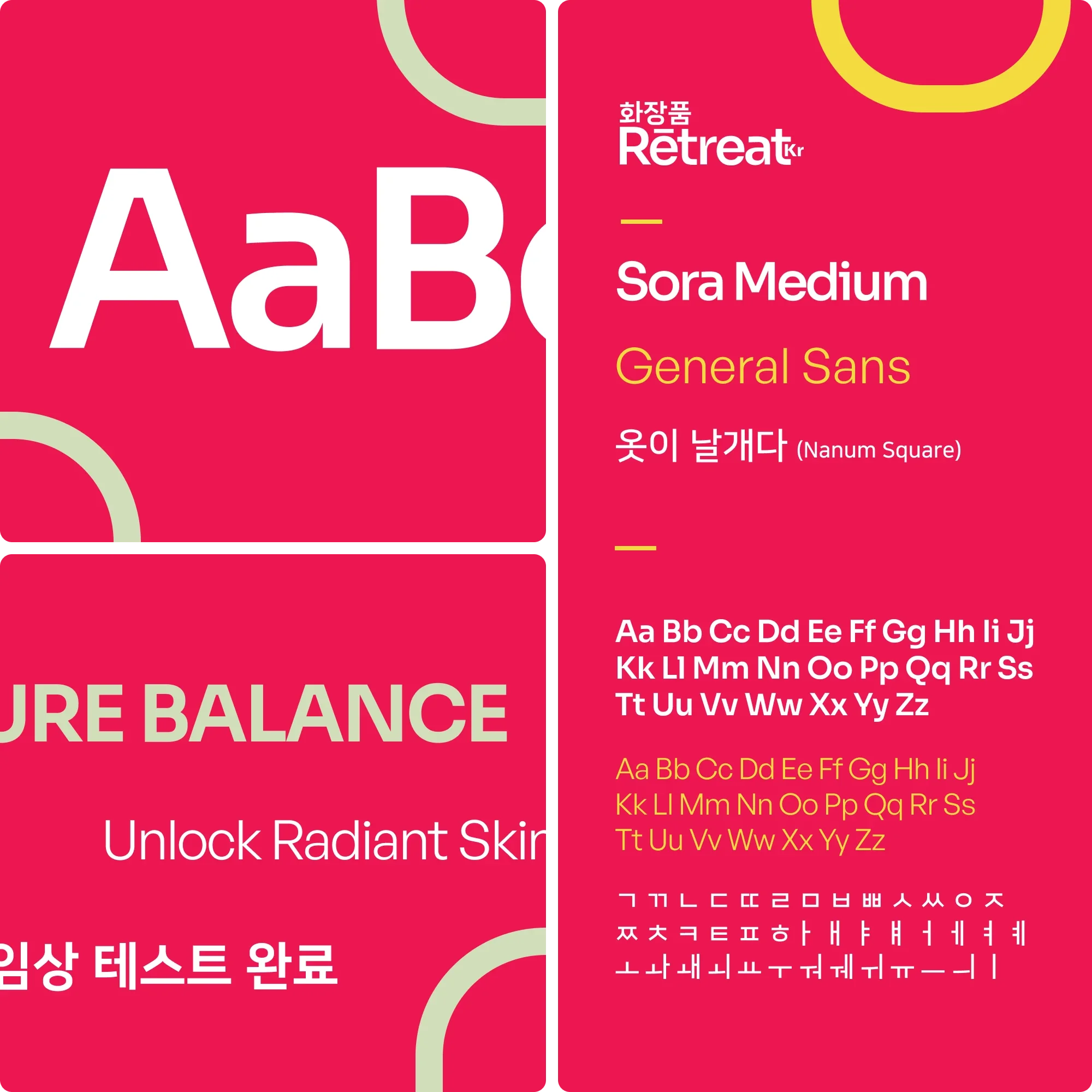
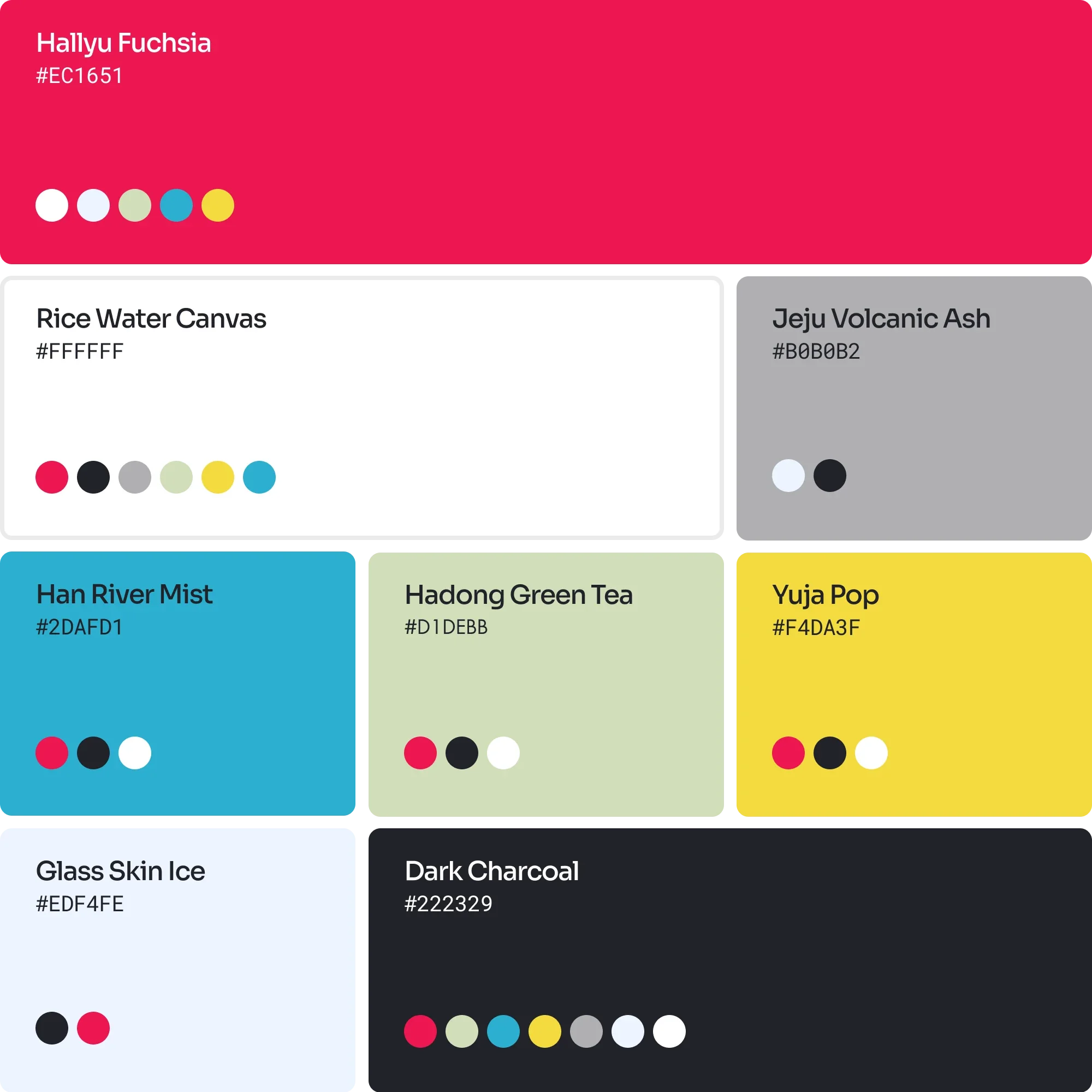
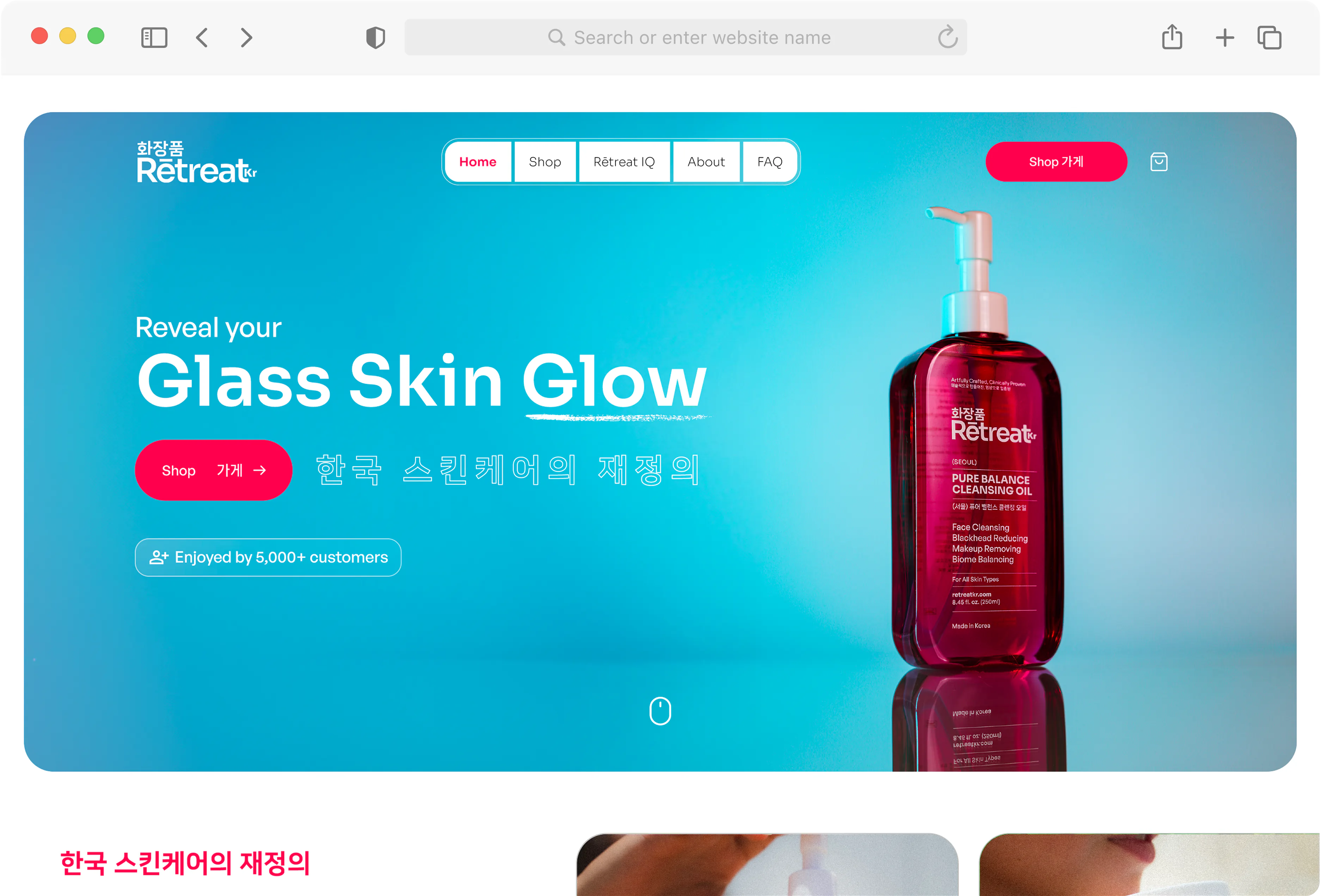
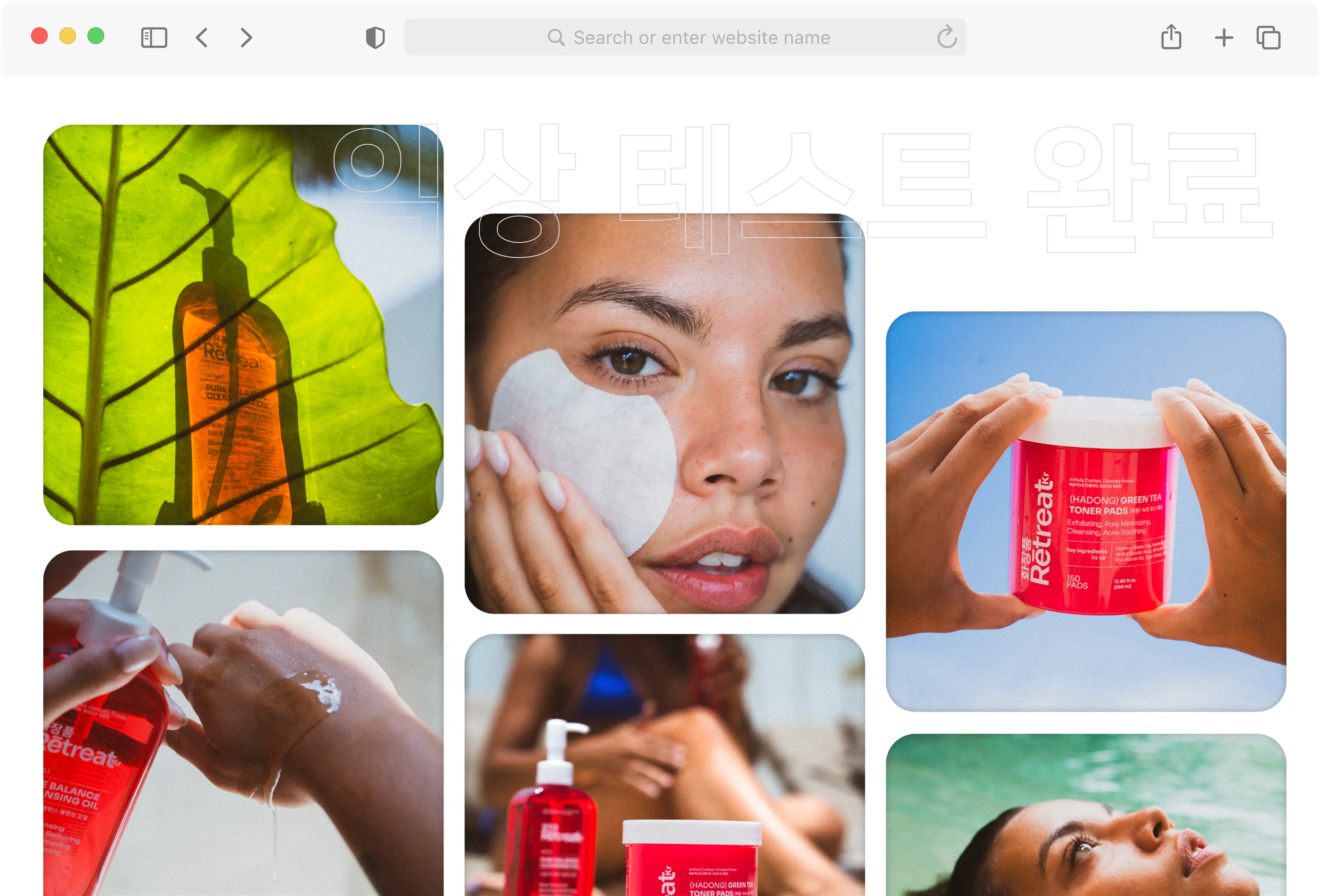
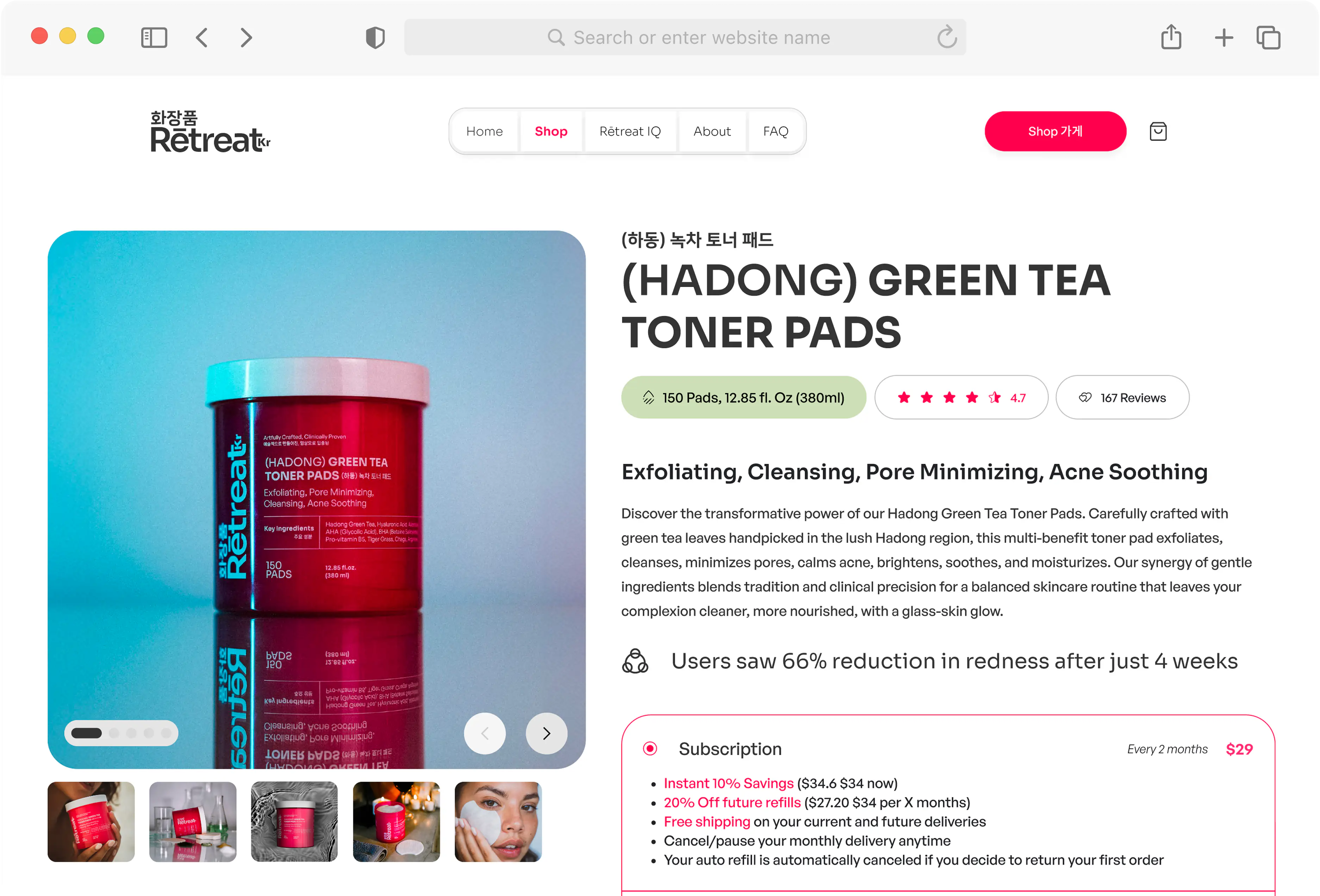
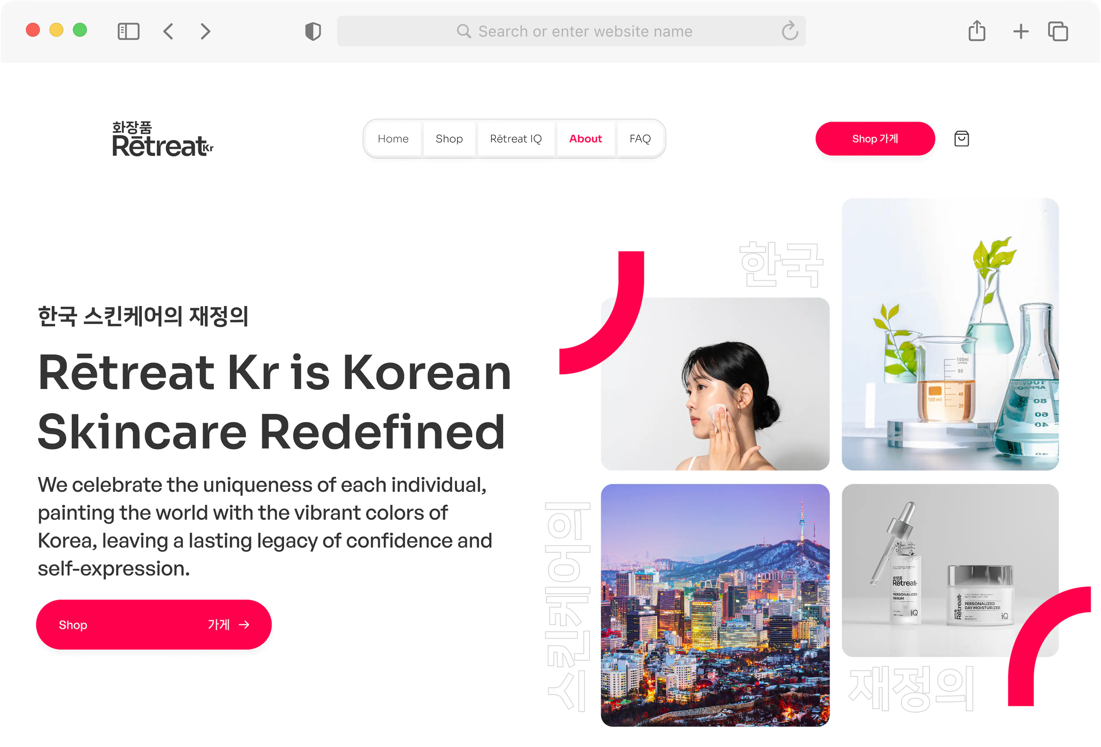
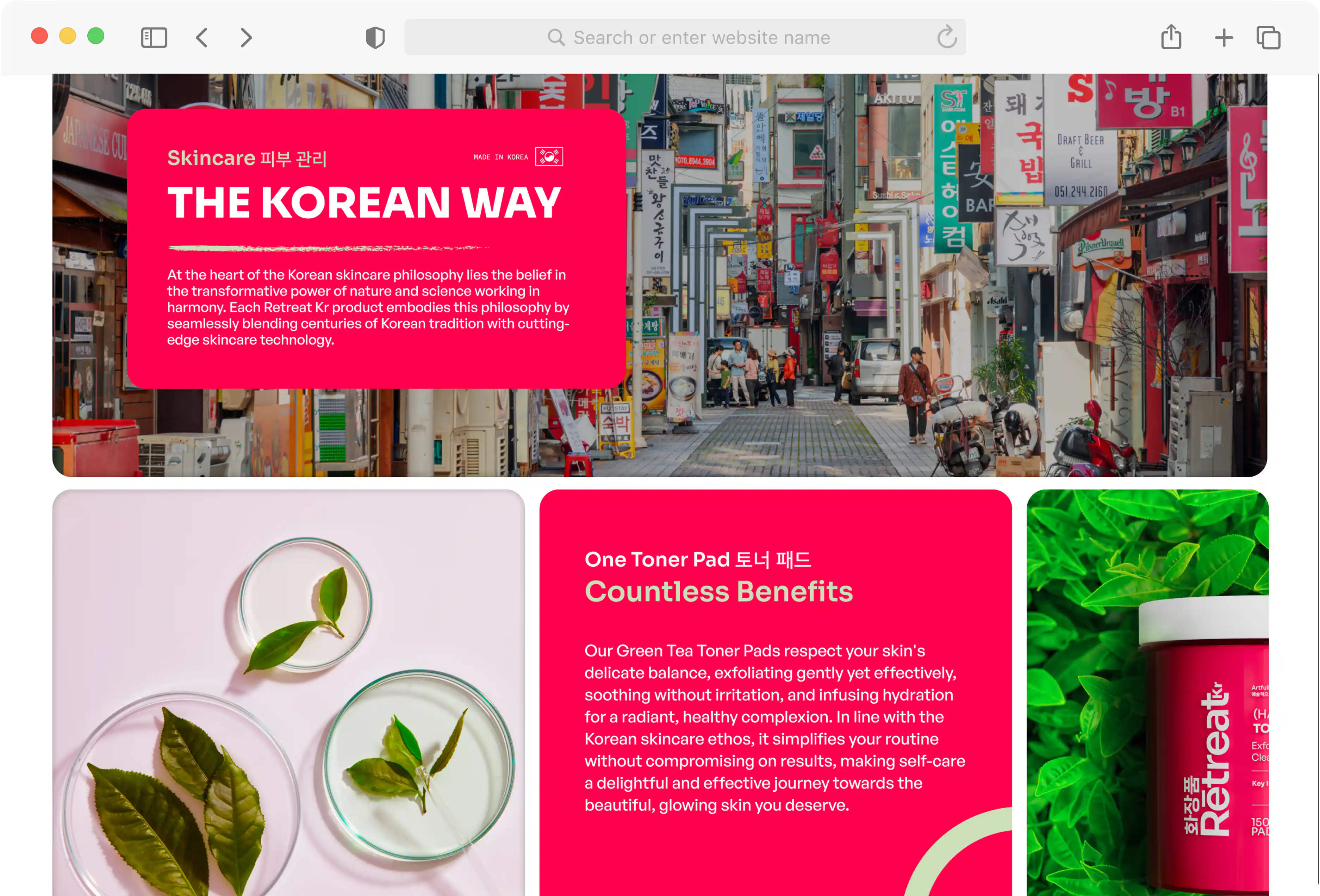
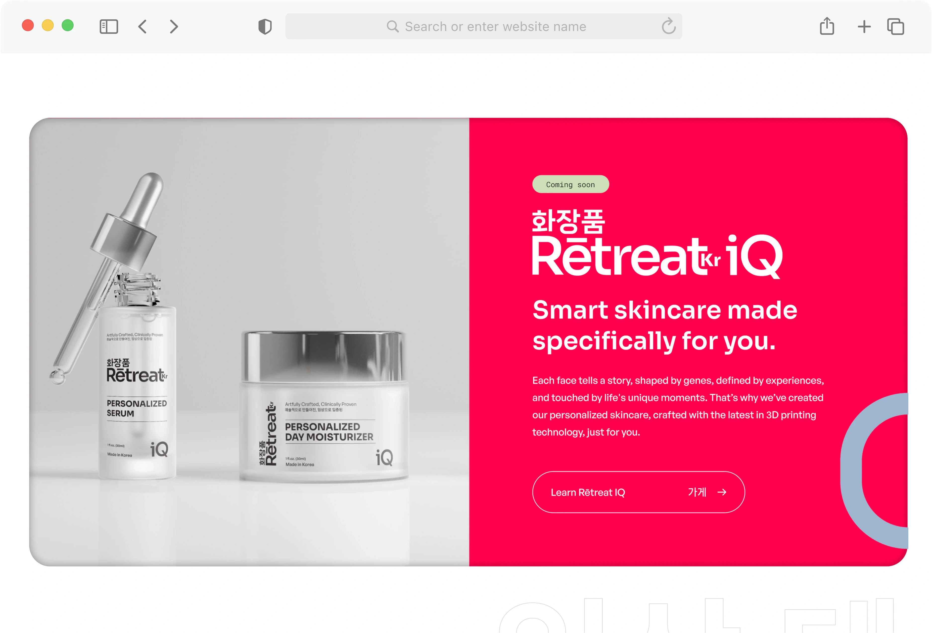
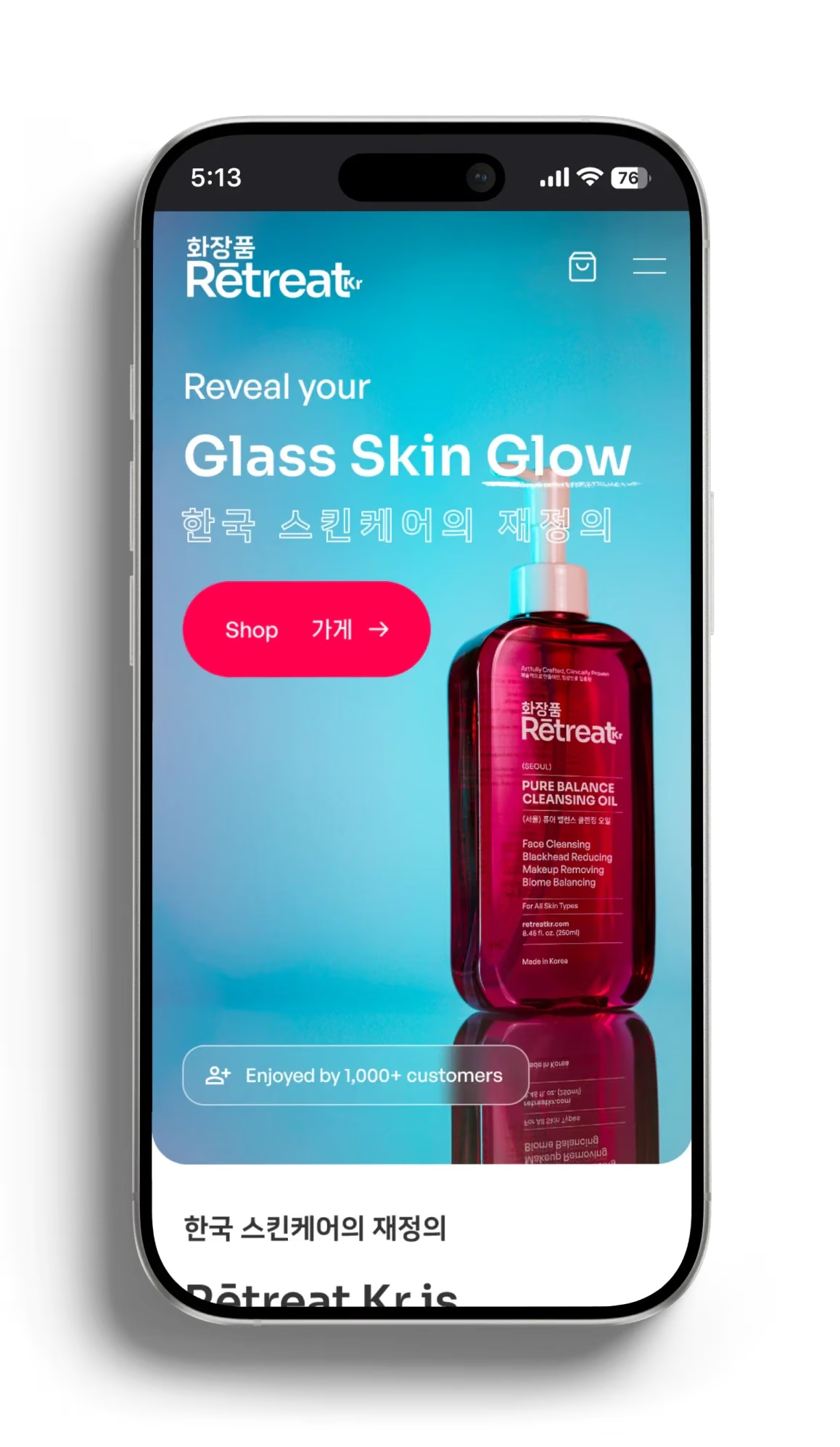
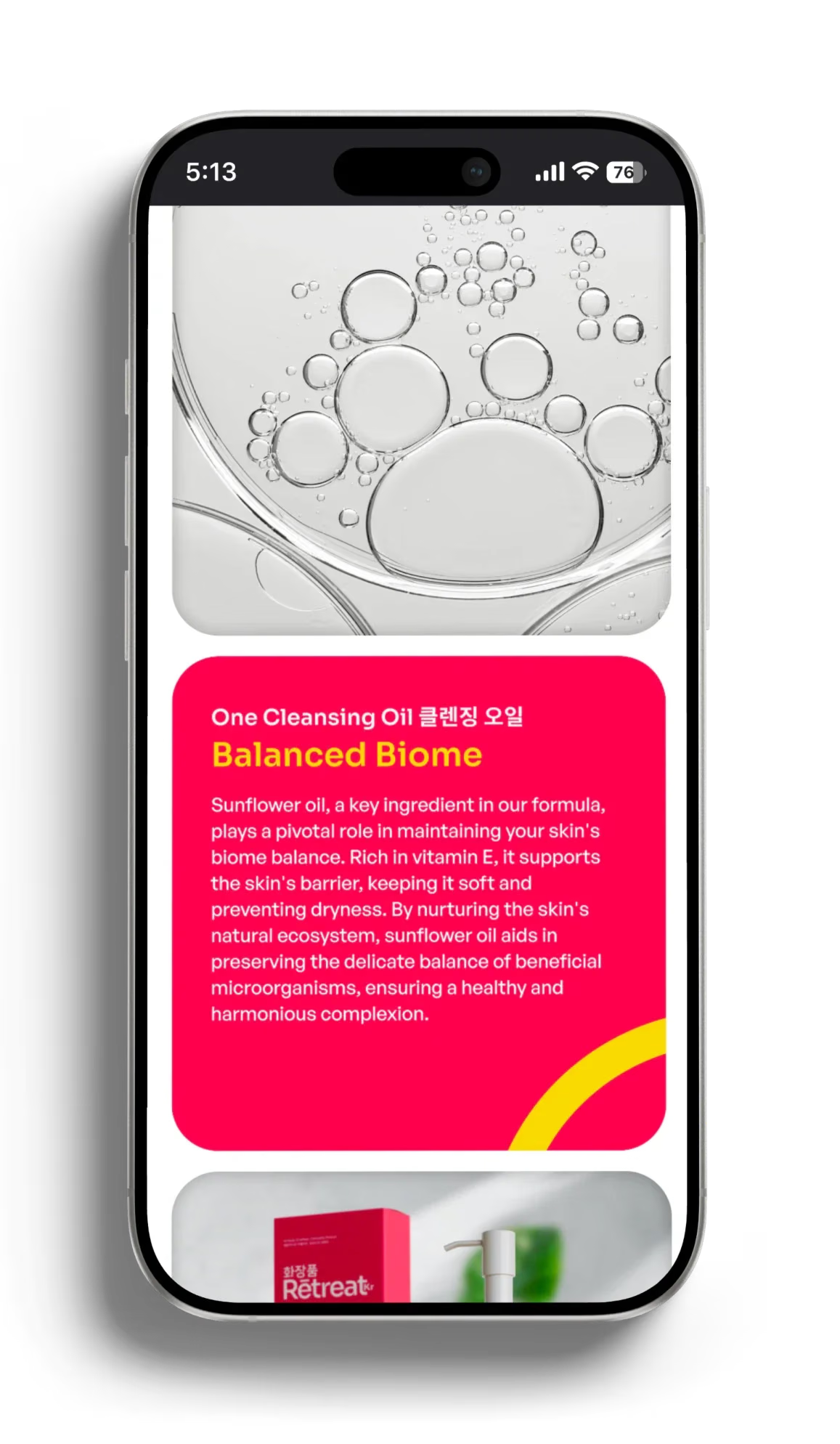
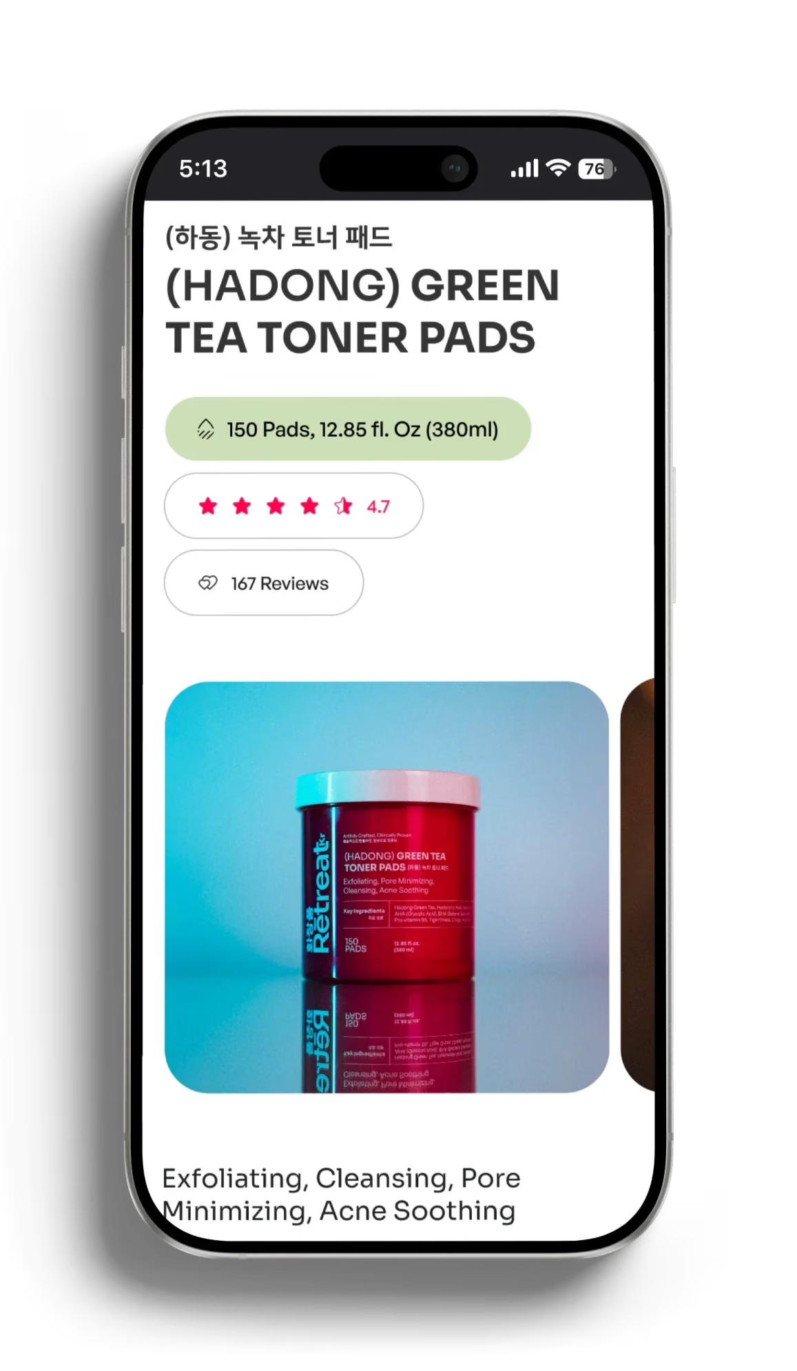
Identity, packaging and digital experience were brought together in one system. Korean typography, a distinctive red palette and a repeatable packaging architecture give the range recognition without reducing its heritage to decoration. On the website, product hierarchy, ingredient information and clearer purchase pathways help the customer move from first impression to informed choice.
02
[
What the system enabled
]
Retreat Kr entered the market with an identity capable of holding the full range together and making its Korean origin immediately recognisable. The system gives new products a consistent foundation across packaging and digital experience.
03
[
MORE PROJECTS
]
Continue exploring



Limassol,Cyprus
Typography uses Hanken Grotesk, Novela and Roboto Mono throughout the site. Supplementary imagery from Unsplash and AI-generated sources.