Magic Ventures
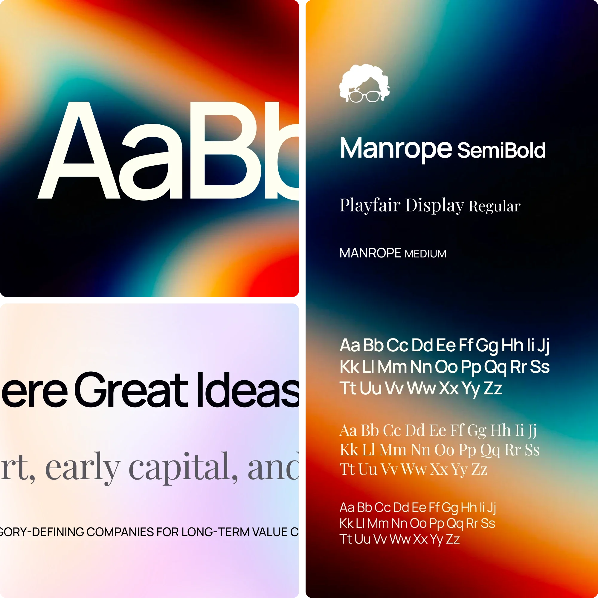
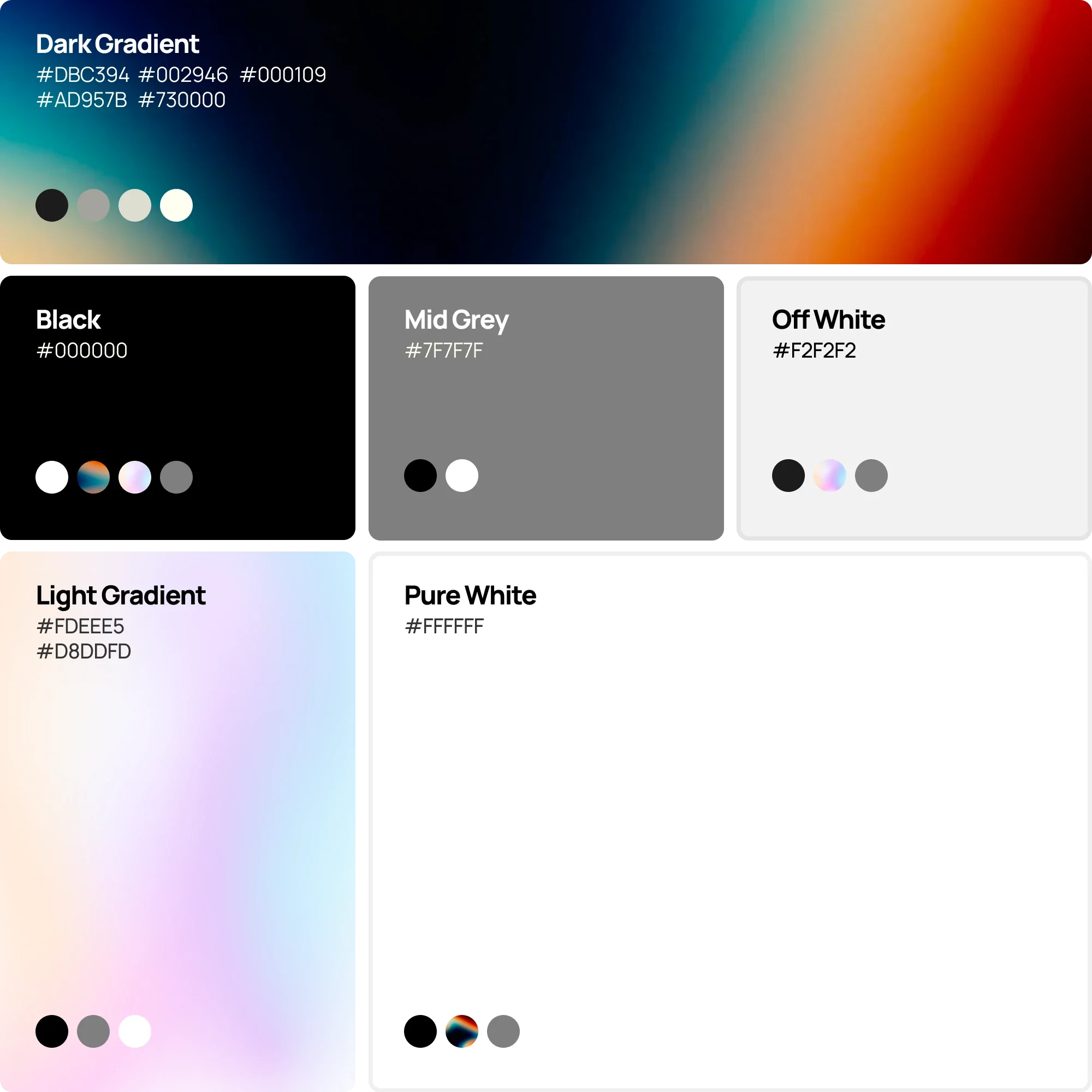
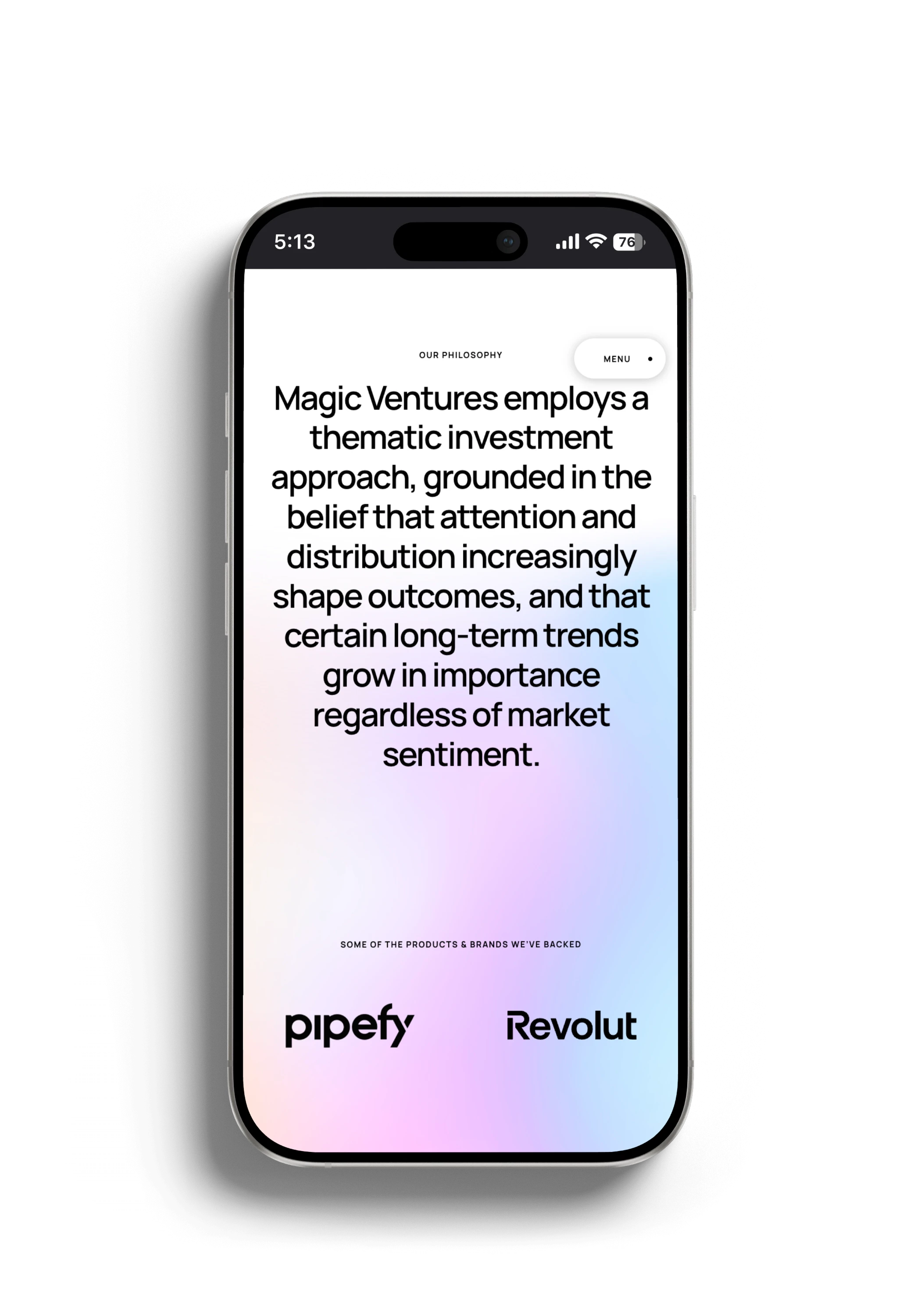
Magic Ventures needed a brand that could express an unusual advantage in distribution while retaining the authority expected of an investment firm. The identity and website bring that tension together, combining attention with restraint.
Duration
3 weeks
Client
Magic Ventures

[
Attention is not authority
]
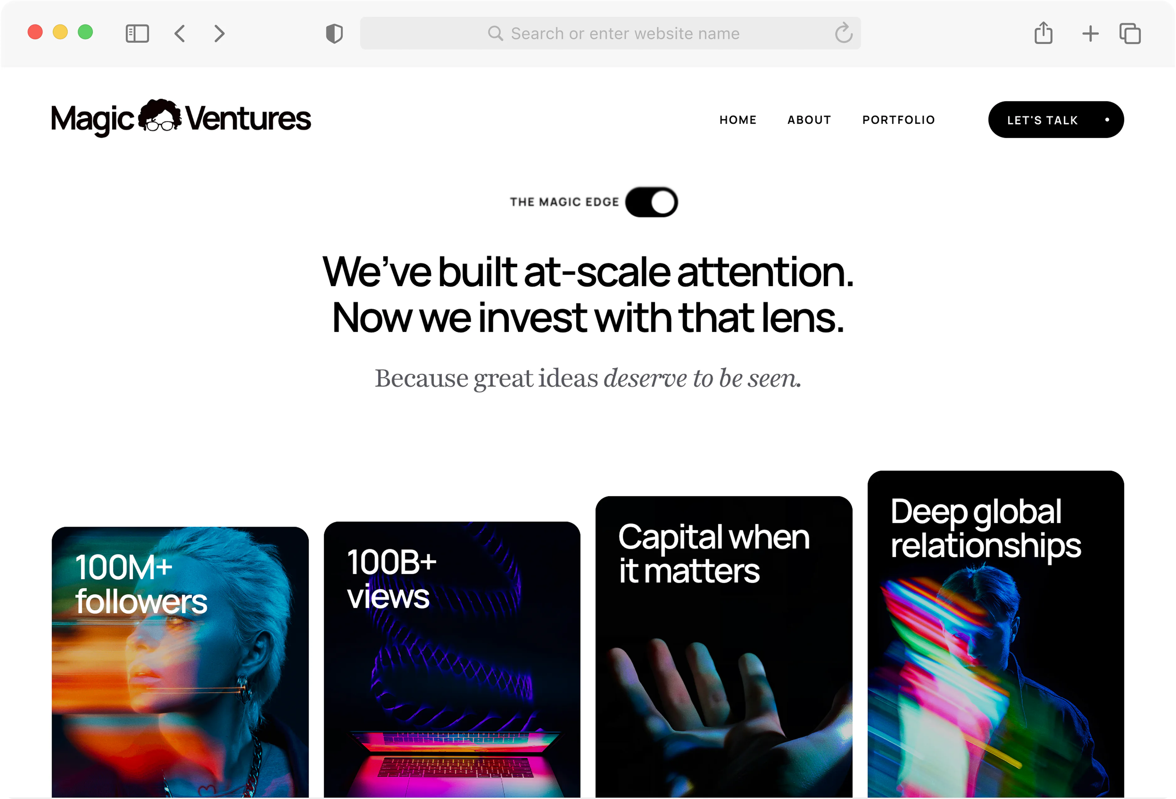
Magic Ventures had access to significant distribution, but audience scale alone could not explain the value it offered founders or earn institutional confidence. The brand needed to make its advantage clear without becoming dependent on personality, inflated claims or the visual conventions of social media. It had to feel credible in a partner meeting and immediately recognisable in a feed.
01







[
Proof before promotion
]
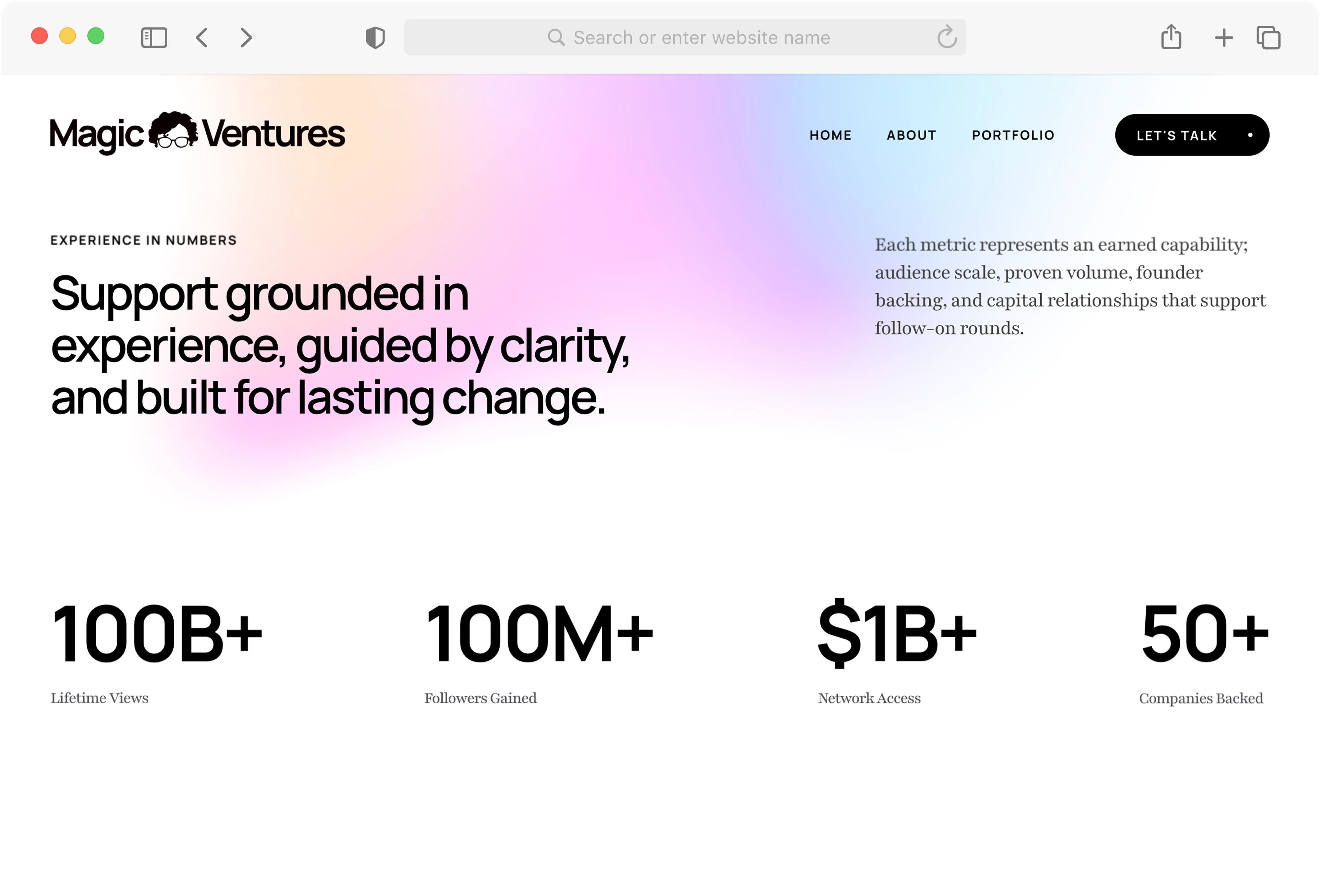
The story is structured around what the fund brings to a company: capital, distribution and practical momentum. Portfolio evidence and proof points establish credibility first. Confident colour and concise language then give the identity its energy. The system is designed to hold together across the website, pitch material, founder communications and fast-moving digital channels.
02


[
What the proposition moved
]
Magic Ventures now has a brand that makes distribution feel like a credible part of the investment proposition rather than an attention claim. The system carries the same balance of energy and authority across founder, investor and public-facing contexts.
03

[
MORE PROJECTS
]
Continue exploring



Limassol,Cyprus
Typography uses Hanken Grotesk, Novela and Roboto Mono throughout the site. Supplementary imagery from Unsplash and AI-generated sources.